
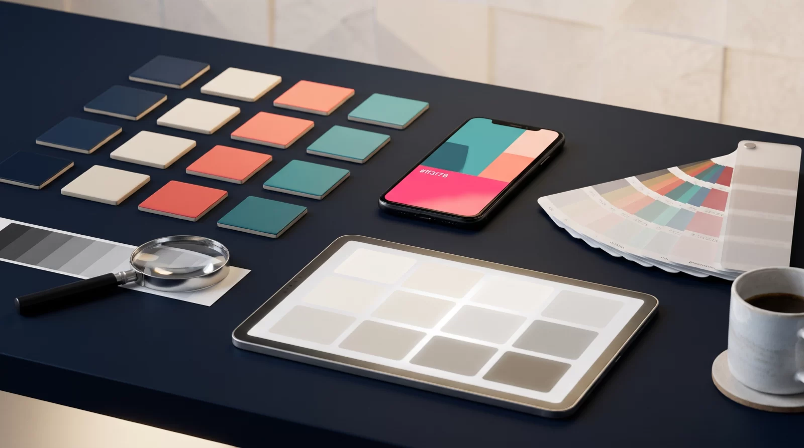
Why Are Color Palettes for a Mobile App a Strategic Decision?
In the first seconds of a mobile app, the user perceives not the content but the screen as a whole. Therefore, choosing color palettes for a mobile app is not merely an aesthetic preference; it is a product decision that directly affects brand perception, readability, and user behavior. A well-established palette guides the user; a poorly established palette makes it unclear even whether a button is clickable. Addressing color decisions before screen flows are finalized, rather than leaving them to the final stage of design, prevents later revisions.
Color Establishes the First Impression Within Seconds
When users open the app, they often read the brand’s tone, reliability, and how consistent it looks through color. Two screens serving the same function can feel inviting on one and complex on the other simply because of a palette difference. For this reason, when defining the palette, first ask “what should the user see first on this screen,” and then place colors according to this hierarchy.
Palette Decisions Determine Maintenance Cost
Colors also live on the code side. A consistent scale derived from a single brand color saves designers and developers time when new screens are added. Scattered, loosely defined colors, on the other hand, bring the same debate back with every new feature.
- Separate the brand color for accent and neutral tones for the background.
- Tie each color to a purpose: primary action, secondary action, warning, error.
- Document the palette in a single file early on and share it with the team.
How Is Brand Color Harmony Established?
Brand color is the strongest signal carrying the app’s identity; however, on a mobile screen it does not always work as it does in corporate identity. On small surfaces, an overly saturated color can be tiring, while a low-contrast tone can become unreadable. Brand color harmony is not abandoning the color; it is adapting it to the conditions of the screen. To establish this balance, color should be thought of not as a “code” but as a scale.
Is It Always Right to Carry the Brand Color As Is?
Some brand colors are more readable with white text, and others with dark text. Producing light and dark variants of the same color both preserves brand loyalty and safeguards readability. If a single color code is defined in the corporate guide, splitting it into separate tones for buttons, links, and accents is a practical solution.
Neutral Base, Brand Accent
Most of the interface consists of gray tones, text, and background colors. The brand color is reserved for primary buttons, active tabs, and important accents. This distinction calms the screen and directs the user’s attention to the right place. Marking every card or heading with the brand color reduces the value of the accent.
Match Color with Meaning
When red is used only for errors and green only for confirmation, users understand the status without reading the screen. Reusing the same color for decorative purposes weakens this intuitiveness. If your brand color is close to red, you need to plan additional cues such as icons and explanatory text for error states.
Accessible Color Contrast: The Measurable Limit of Visibility
Contrast takes the readability of color out of personal taste and moves it to a measurable threshold. The WCAG guidance states a recommended ratio of 4,5:1 for normal text and 3:1 for large text and interface components. These thresholds aim for the design to still work for people using a screen on a sunny street or at low brightness. Accessible color contrast is not just a legal requirement; it is the foundation of usability.
What Does the Contrast Ratio Guarantee, and What Does It Not?
The ratio measures the perceptible difference between text and background; however, font size, weight, and screen density also affect readability. A contrast at the limit may be insufficient for small-point text. Therefore, when measuring, use actual font sizes and actual color codes.
Practical Ways to Increase Contrast
- Reduce eye strain by using dark gray tones for text instead of pure black.
- If you use the brand color as a button background, test the text color separately.
- Support status information not only with color but also with icons and text.
- For secondary text, prefer a defined gray tone instead of opacity.
Where Should You Start Testing for Color Blindness?
Starting by converting screen captures to grayscale quickly reveals areas that remain dependent on color distinction. Then check graphics, charts, and status labels with common color blindness simulations. The goal is not perfection but preventing loss of information.
Creating a UI Color Palette: A Step-by-Step Process
Creating a UI color palette is about building a system, not picking colors one by one. The sequence below makes it easier for design and development to speak the same language. The goal is not to debate color again on every new screen, but to move forward with a ready, consistent, and measurable set.
Define the core scales and roles
1. Derive a scale from the brand color
Create a tone scale with at least five steps from light to dark. The lightest tones can be used for backgrounds, mid tones for hover states and borders, and darkest tones for text and primary buttons. Check the contrast of each step against white and dark text separately.
2. Lock down neutral grays
Define separate gray tones for backgrounds, cards, dividers, and text. The choice of warm or cool gray should harmonize with the brand color's tone. Leaving gray tones “approximate” is the most common cause of inconsistency across screens.
3. Separate semantic colors
Define distinct colors for success, warning, error, and information states. Even if these colors sit outside the brand palette, choosing them from the same family of saturation and brightness preserves interface cohesion.
Assign color to components, not components to colors
Document which color will be used for every state of buttons, input fields, cards, and alert components. This way, when designing a new screen, you do not choose a color; you only select from a defined role.
Document the palette in a single source
Color codes, intended uses, and contrast notes should live in the same document. If the style definitions in the design tool and the variables in code use the same names, the entire product can adapt in one move when the palette is updated.
Test, Measure, and Maintain the Palette
A palette succeeds not because it looks good in the design file, but because it works on real devices under real conditions. The final step in the mobile app color selection process is therefore testing and continuity. Even after launching the palette, the system must be protected as new screens, campaigns, and seasonal visuals are added.
Test on real devices and in real light
Review the design at least once at low brightness and once in daylight. Different screen technologies can render the same color differently; thin borders and secondary text especially reveal themselves during this check. Automated contrast tools are a good starting point, but the decision must be confirmed with the user's eye.
Keep a small but regular checklist
- Is every newly added component fed by existing color roles?
- Is status information also conveyed by a signal other than color?
- Is there any shift in meaning between light and dark themes?
- Do campaign visuals stray outside the palette?
Connect user feedback to color decisions
Support requests and usage analytics can show which screens are hard to read. Feedback such as “I couldn't see this button” may be a hierarchy issue rather than a palette issue, but it often intersects with color decisions. Reviewing these signals regularly with the design team turns the palette into a living system.
If you want to build a color system that addresses brand alignment, contrast, and usability together, you can contact the CSA Medya team and we can review your existing interface together.
Key takeaways
Treat your brand color as a scale
Instead of a single color code, create a shade scale with at least five steps from light to dark. This scale provides flexibility for buttons, links and accent states while preserving brand color recognition. Test each step with both light and dark text, so you don’t have to search for a new color when adding components.
Set neutral tones early
Much of the interface consists of background, card, divider and text colors. Leaving these gray tones undefined is the most common cause of inconsistency across screens. Defining a neutral family that matches the warmth of your brand color and mapping it to background and text roles makes your work easier in terms of both consistency and contrast.
Measure contrast against standard thresholds
Treat ratios of 4.5:1 for normal text and 3:1 for large text and interface components as your starting threshold. Measure using the actual font size and actual color codes. A ratio that sits at the limit may be insufficient for small text; also do not rely on color alone for status information—support it with icons and text.
Document the palette and test on real devices
Collect color codes, intended uses and contrast notes in a single document; make sure the design tool and the variables on the code side use the same names. Before launch, check the palette at low brightness and in daylight on different devices. Regularly review whether every newly added component draws from the defined color roles.
Frequently asked questions
How many colors should a mobile app ideally use?
There is no fixed number; however, most apps work with a brand color, several shades of that color, a neutral gray family and semantic colors such as success, warning, error and info. What matters is not the number of colors but that each color has a role. Colors without a defined role lead to inconsistency in the interface over time and unnecessary emphasis clutter.
Which ratios should I target for accessible color contrast?
WCAG guidance recommends a ratio of 4.5:1 for normal text and 3:1 for large text and interface components. These thresholds are a starting point; choosing a higher ratio for small type and thin borders improves readability. You need to measure using the actual font size and actual color codes.
What should I do if my brand color does not meet the contrast threshold?
Rather than abandoning the brand color entirely, create light and dark variants. Also test the text color separately for the color used as a button background; if needed, darken the background tone slightly and pair it with white text. Using the accent color on smaller surfaces such as icons, borders or headings is also a practical solution that preserves brand loyalty.
Should I prepare a separate color palette for dark mode?
Yes, dark mode does not work well by automatically inverting the same palette. On a dark background, saturated colors appear brighter and can cause eye strain; so accent tones should be softened slightly, and depth should be built with surface tones rather than shadows. Semantic colors must also be re-tested for contrast on dark backgrounds.
Is it necessary to test the color palette with users?
It is useful, but extensive testing is not required at every stage. In particular, a quick readability test with a few users on critical points such as primary action buttons, form error messages and charts can surface overlooked contrast and hierarchy issues early. Support requests and usage analytics can also be used as an ongoing source of feedback.
How can I keep the color palette consistent within the team?
Define colors with role names in a single document: primary, secondary, background, divider, error, and so on. Style definitions in the design tool and variables in code should use the same names. When adding a new component, do not choose a color; select from an existing role. This approach keeps the whole product consistent when the palette is updated.